Documentation for ColorJoy.me
Accessibility Modal
Underneath every palette you find a button for accessing more information about accessibility.
{info} Information is restricted to users with subscription.
Example palette
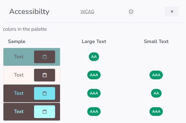
Let's look at an exmaple palette.

The overlay that opens shows contrast levels for large and small text of colors within the palette. Combinations of colors that don't meet this standards are omitted.
This display gives you an idea of which combinations of colors are suitable if you plan to use them in background/text combinations.
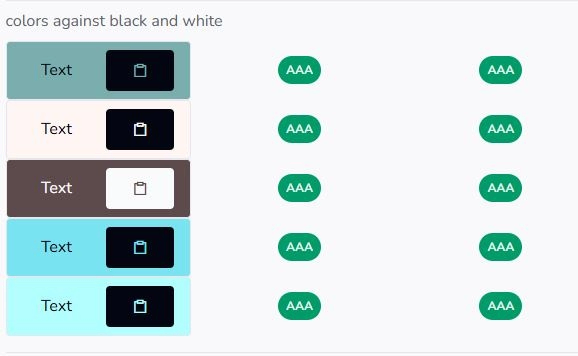
The next section explores the contrast levels of the colors against black and white. As text is often written with back or a very dark color on light backgrounds or vice versa, this display shows combinations for that.Again, only combinations are shown, that pass a AA or AAA test for small or large text.
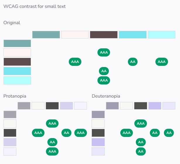
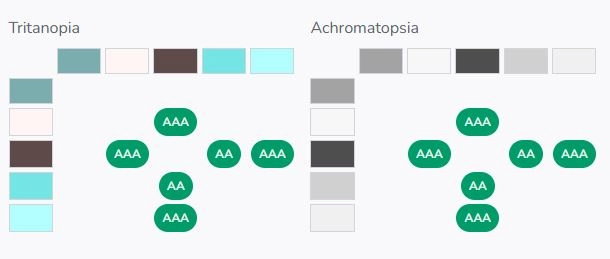
To complement this information for color blindness as display is provides, how the palette might be experience for different types of color blindness.
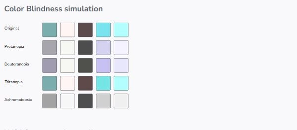
We feel, this is in itself helpful, but it lacks information about contrast levels. As far as we know there are no standards for contrast ratios under color blindness, we just use the WACG definition for the palettes under color blindness.