Documentation for ColorJoy.me
Palette details
This page contains information about the palette. It contains many displays and derived palettes.
Ok, let's start with an example palette

Underneath the palette you find buttons to save the palette into the selection, into the vault, into a collectio, to copy a link to this page, to edit the palette.
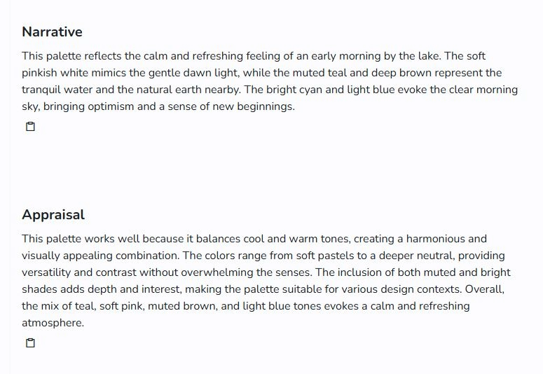
Narrative (AI) & appraisal (AI) for public palettes
AI narrative and appraisal are just a complement. It uses the unique ability of AI to come up with a likely answer, because it takes many different sources into account. Thus there is likely some value in these assessments. Before any assessment is published, it is checked by human supervision.
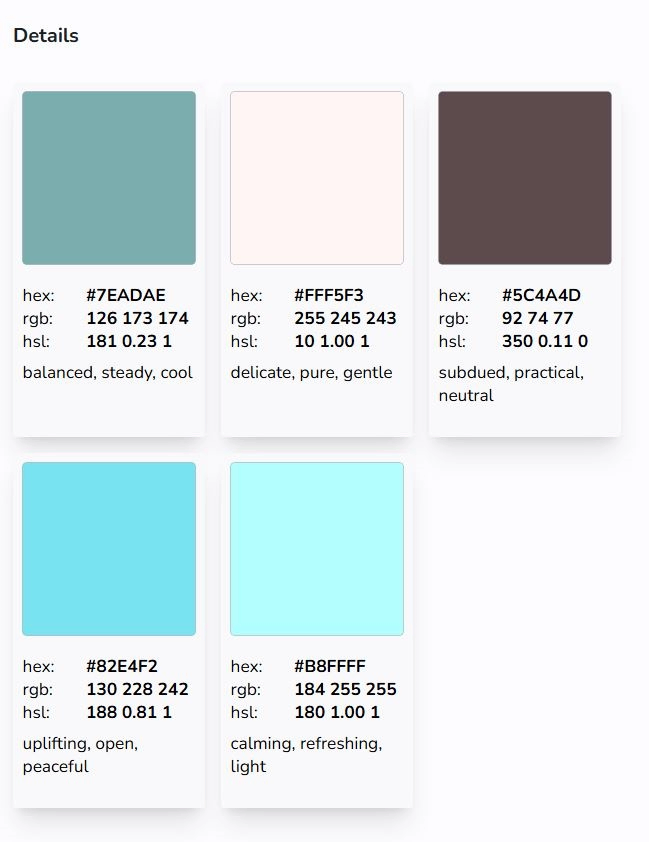
Details
Here are color patches with color values,an emotional response, and the tags. We have our own system to assign likely emotional responses to colors. This is developed on the bases the results of 100 years research, knowing that some regional or cultural differences exists.
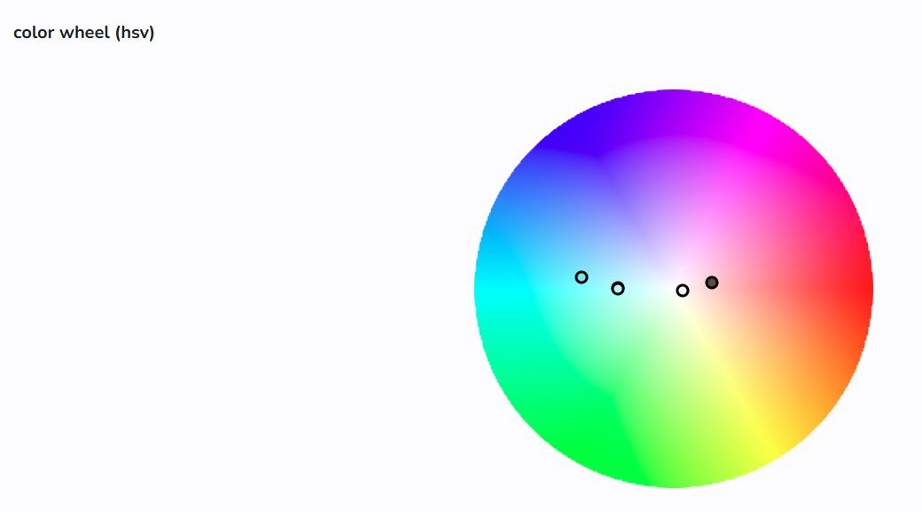
Color wheel
This give you an idea about the location of the colors on a wheel. This representation is about hue and saturation and less about lightness.
Notice colors in the center are strongly de-saturated. It can mean white or black. Also lightness cannot be easily represented in this kind of chart. The darker dot for a color indicates a dark shade, whereas light dot is a lighter share of the color an this location.
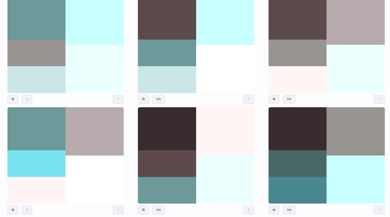
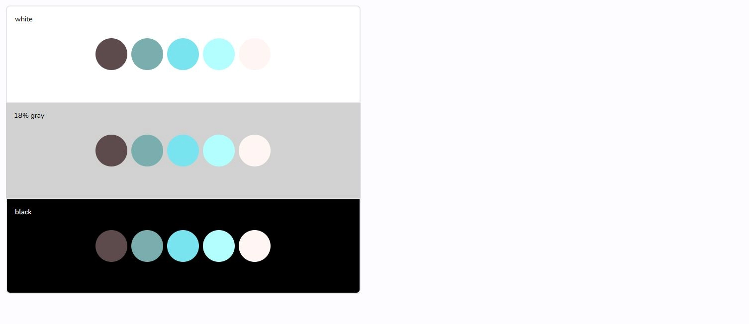
Palette against white/black/gray
This section shows how the colors look like gainst black, white of 18% gray. It is often used by designers and photographers, to get a feel how colors perform together with neutrals.
Sample icons
![]()
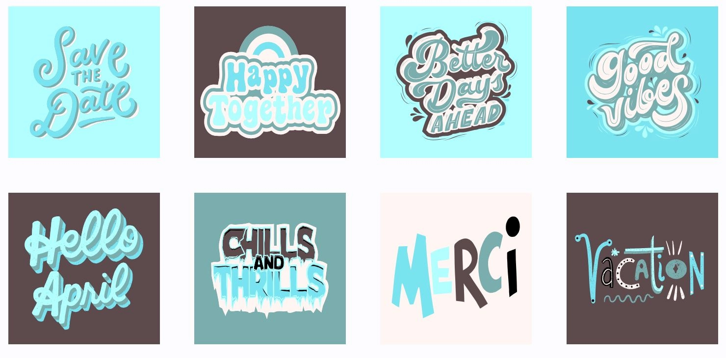
Sample typography
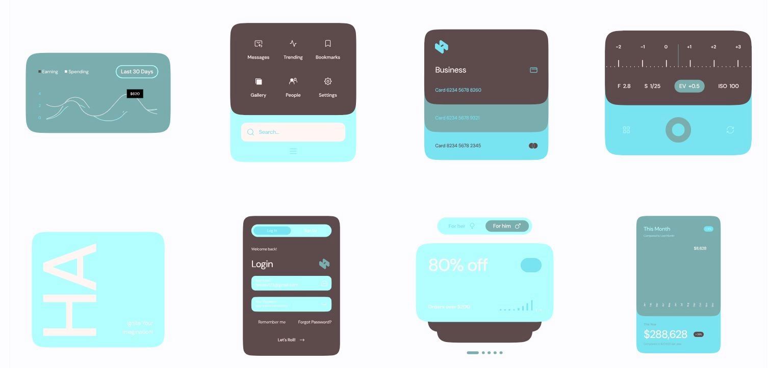
Sample ux/ui
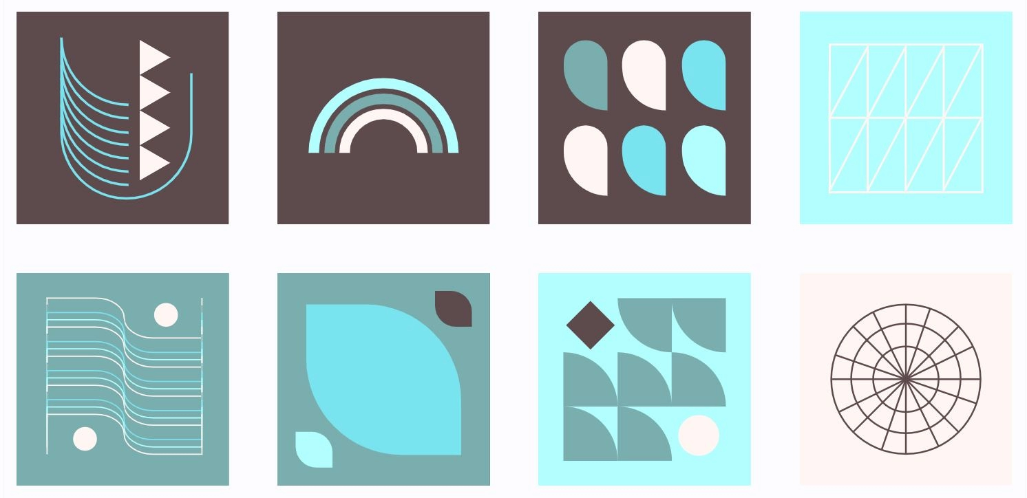
sample illustrations
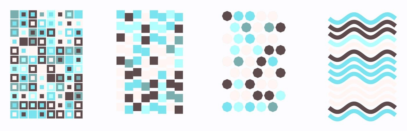
sample patterns
sample designs

fashion examples

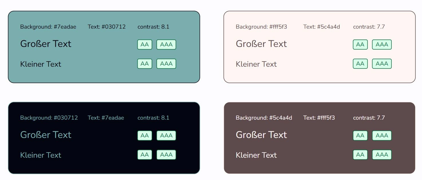
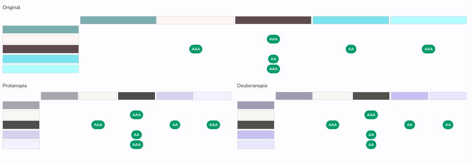
contrast checker (Accessibility with subscription)
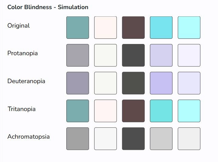
blindness simulation (Accessibility, with subscription)
This is a simulation for various forms of color vision deficiency. Screen colors can vary and often do not reflect colors well in nature. Therefore, this simulation only provides an indication of the effect for color vision deficiency.
To test or optimize, use colour combinations that produce distinguishable colors for all forms of colour vision deficiency. Or simply use the distinguishable colors in your palette.
The color calculations are based on https://ixora.io/projects/colorblindness/color-blindness-simulation-research
Red-Green Color Vision Deficiencies
Protanopia
- A severe form of red-green color blindness
- Caused by missing L-cones (red-sensing)
- Unable to perceive red light at all
- May only see blues and gold, and confuse red with black
Deuteranopia
- A severe form of red-green color blindness
- Caused by missing M-cones (green-sensing)
- Unable to distinguish between red and green at all
Blue-Yellow Color Vision Deficiencies
Tritanopia
- More severe form of blue-yellow color blindness
- Unable to distinguish between blue and green, purple and red, and yellow and pink
- Colors appear less bright
Complete Color Vision Deficiency
Achromatopsia
- Complete color blindness
- Unable to see any colors at all
- May have trouble seeing clearly and be more sensitive to light
- Also called monochromacy
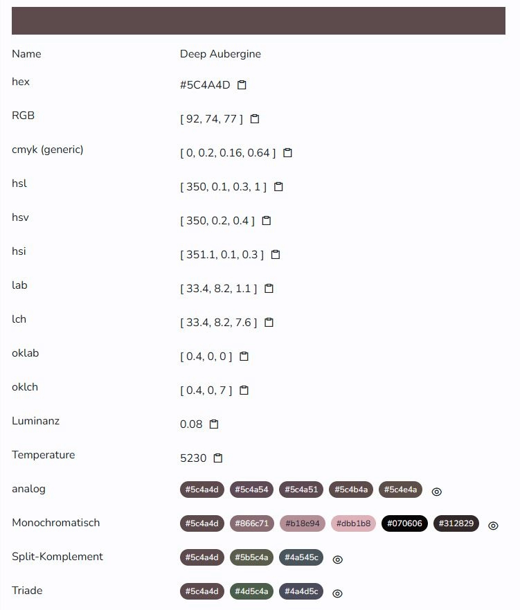
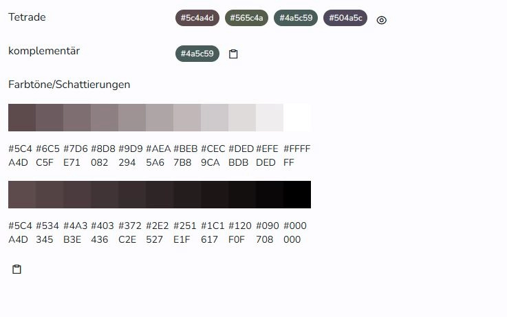
color values
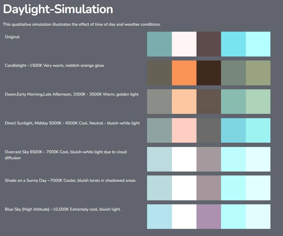
daylight-simulation (subscription required)
Colors are perceived differently when illuminated with light of different color temperatures. This display provides a simulated version of the palettes for different color temperatures.
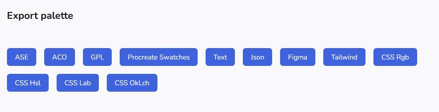
export palette
This area is limited to users with subscription. More info
derived palettes
By varying the the saturation and lightness of the different colors and remixing them into new combinations many new color palettes are created, that provide an alternative to the existing palette. Sometimes you may need an additional color, that goes well with the existing palette. This if the place where you find the additional colors.